
Monday, February 27, 2012
Monday, February 20, 2012
Typography Essay
My project demonstrates the rule of thirds because, I believe, it can easily be divided into three different sections both vertically and horizontally, each containing different levels of content and energy. Admittedly, my project is somewhat lacking that sort of cohesive nature that it was intended to have, but I still think there's some fluid movement from word to word.
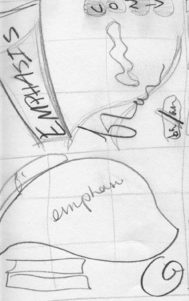
I played around both with the size of the words as well as the font, to build contrast within the piece and make it more visually interesting. Emphasis is much larger than the other words for the sake of emphasis. The letters in "alignment" are ironically misaligned. My design for balance is probably the simplest; I just elongated the "L" to create an imbalance. The contrast of the word "contrast" doesn't play off of any other word. Instead, I used different fonts to spell the first and second half of the word. The way flow looks lends itself to a flow-y feel and repetition simply repeats itself in a loop.
Next time, I will play around a little more in Photoshop to learn different tools and techniques to add visual depth and fill the vacant space in between my words.
Friday, February 17, 2012

Wednesday, February 15, 2012


Wednesday, February 8, 2012


Subscribe to:
Posts (Atom)